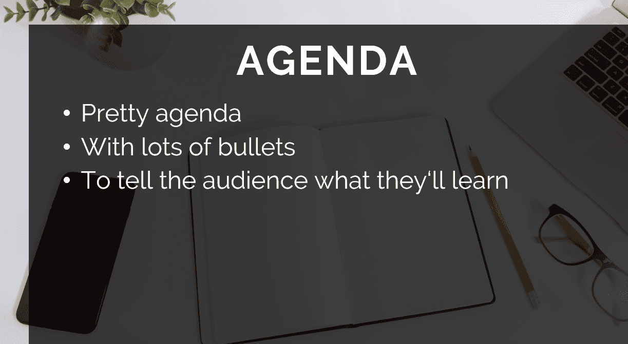
Does this slide look familiar to you?
Look a little like your corporate template?
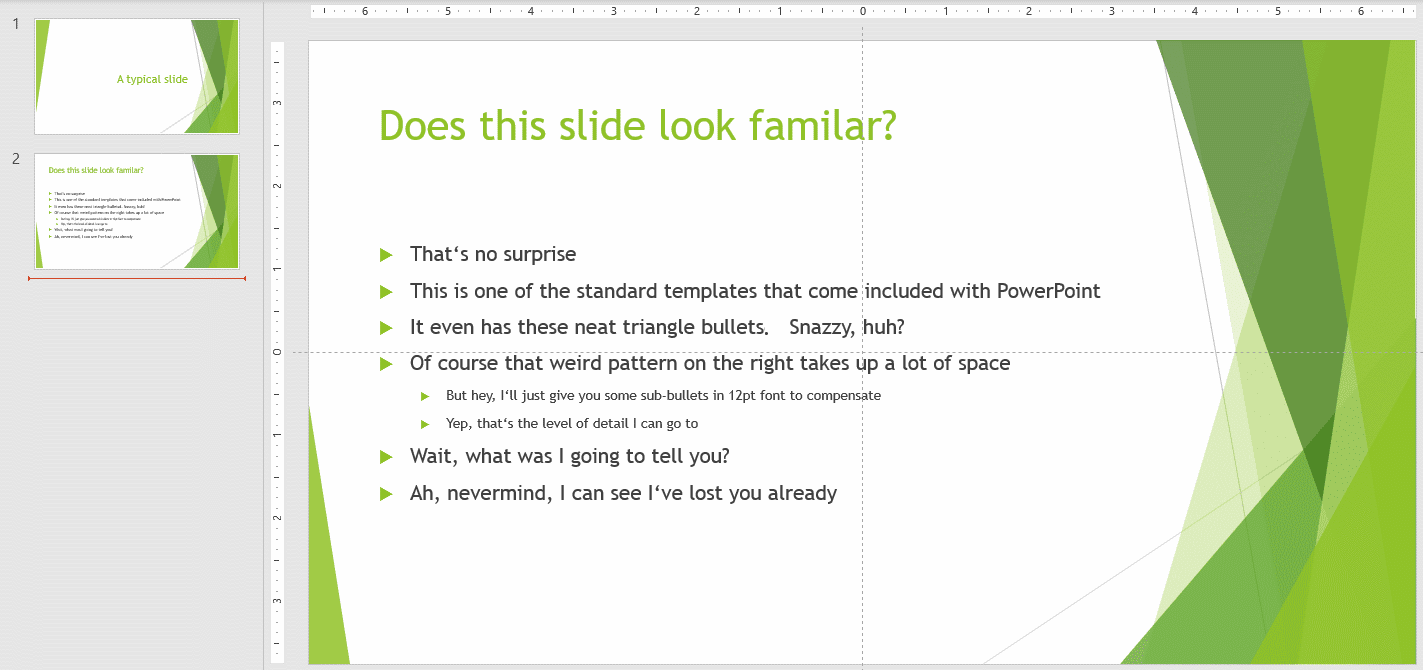
It’s actually one of the built-in templates that come with Microsoft PowerPoint.
Bleh 🤮
Feel a little guilty now for having used something just like it on a webinar?
Don’t!
It’s ok. Really.
But you can do better. Oh so much better!
What? You’re not a designer, you say?
Not a problem. I ain’t one either. And yet I get compliments for my decks all the time.
My secret? It’s all in the patterns I use. Let me explain…
A presentation is nothing but a structured way to convey information. I like to think of that structure as a pattern.
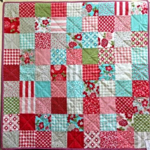
Picture a quilt for example. It probably has a macro-pattern of large squares. Each square contains a smaller pattern and in some cases, these smaller patterns repeat. Sort of like this quilt from Ann Ferguson:
That’s how I think of a slide deck.
The overall structure of my presentation is the macro pattern.
This quilt’s macro-pattern is a checkerboard.
My favorite macro pattern is “Tell / Tell / Told”.
It’s been around since the early 1900’s and the beauty of it is that you can apply it to absolutely any topic. It goes like this:
- First, tell them what you’re going to tell them.
In webinars, this is already mostly accomplished by your email invite and landing page and then confirmed by your title slide. - Next, tell them why they should listen.
This is where you answer their “What’s in it for me?” question. Highlight what they will learn and why you’re the best person to learn it from. - Then, tell them.
This is where you walk through your main content. - Lastly, tell them what you told them.
Summarize your key points and combine your conclusion with a clear set of actions you want your audience to take. This last step is to motivate your audience to apply and internalize the content so they can reap the rewards.
Ok, so you might wonder: “This guy just demonized off-the-rack templates only to turn around and pitch the benefits of pre-built themes? Buddy, are you nuts?”

Bear with me.
Yes, the bland slide templates PowerPoint comes with, the awful free templates you can download from spammy presentation download sites, & most likely also your boring corporate template are to be avoided at all cost.
But don’t let that keep you from saving boatloads of time by creating your own template.
That’s exactly what I do for my webinars. I have a standard template with a bunch of ready-made patterns that I adapt as needed. Every now and then I find the existing template lacking and I’ll add a new slide to it.
Here’s what’s really cool, though. You don’t have to start where I started (from scratch, ugh!).
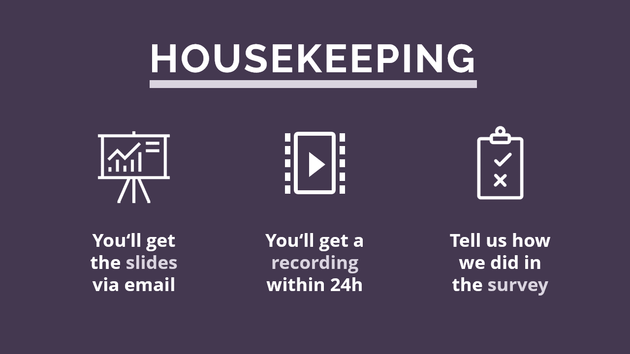
You can take the shortcut: Just grab my template! It’s completely optimized for webinars, full of handy-dandy slide templates, and absolutely free. Oh, and it has the most common webinar slides like housekeeping, speaker intro, Q&A, etc. already built-in. Pretty nifty, right?


[2] Steal a color palette
Developing the eye of an artist is hard. Picking a color palette that appeals to you is easy. My favorite tool for creating your own is Coloors. If you’d rather go with a color scheme someone pre-picked, Colourlovers is great.
[3] Get pre-paired fonts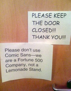
There is a whole series of memes out there making fun of Comic Sans, so you’ll want to make sure you show some taste in the fonts you use. To stick with my theme: Developing taste is hard, selecting pre-paired fonts is easy. Just head over to fontpair.co.
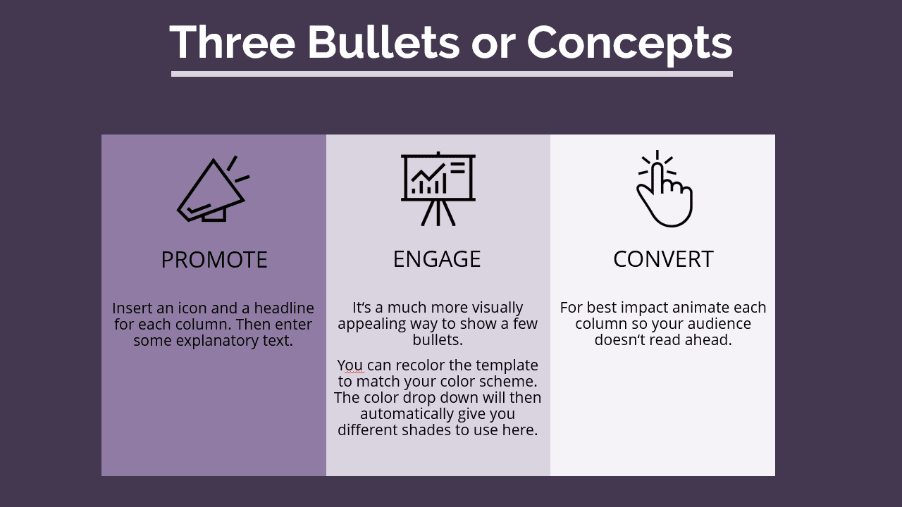
[4] Use the “Rule of Three”
I know, kinda ironic as a fourth bullet point 🙄😉
The rule of three states that people have a hard time keeping more than three things in short term memory. All good things come in threes after all. The slide template I shared above has patterns that use the rule of three. Here’s are some examples:
Austin Kleon has a fun book called “Steal like an artist”. The basic idea is that nothing is completely unique. Everyone builds on what has come before.
So the easiest way to get inspired is to steal and adapt until your mashups develop a style of their own.
So when I say design your own patterns, what I really mean is steal patterns you like, then make them your own. A good starting point for stealing beautiful slides is the all-time top 100 on Slideshare.
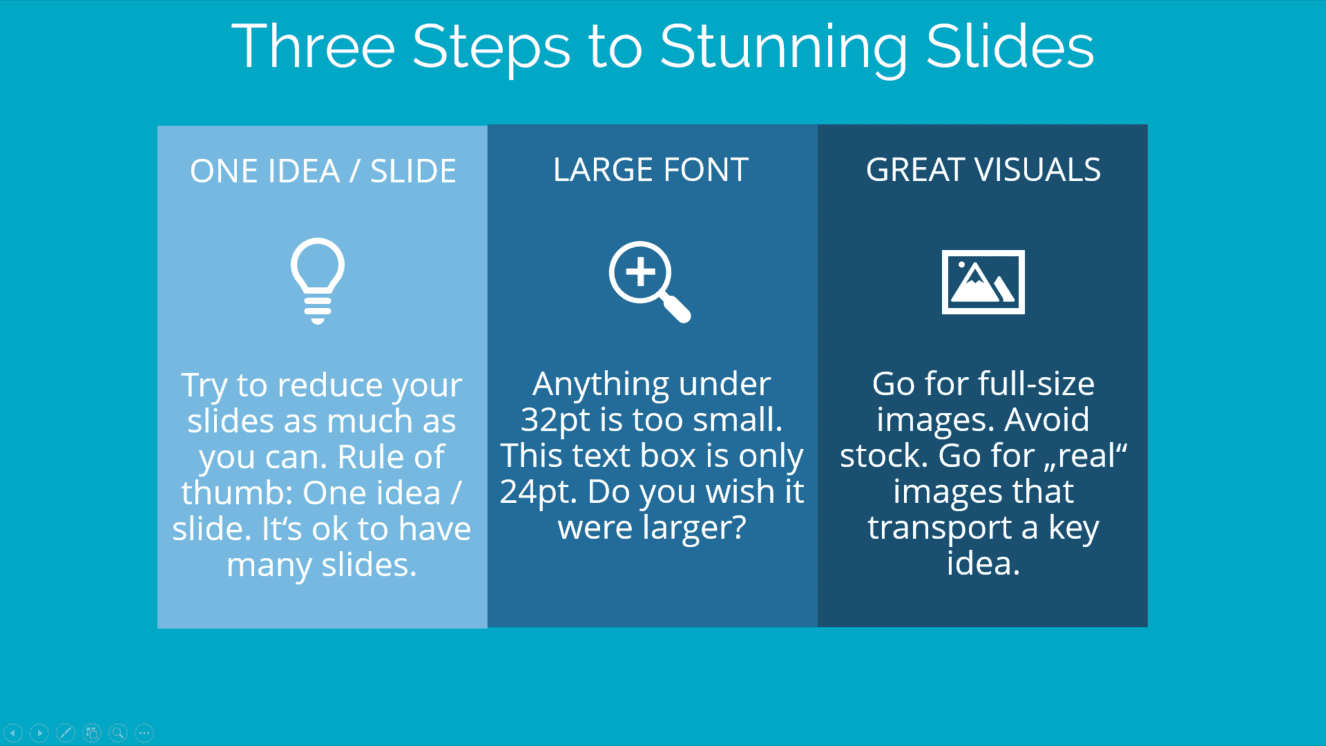
I already told you to use images that cover the entire slides and REALLY LARGE, BOLD FONT.
That’s the opposite of a two-column slide with 20+ bullets on it.
Another way to say this (because it bears repeating) is that each idea gets its own slide.
That’s right: One idea per slide.

Webinars are a long-form content type and it’s easy for people to get distracted.
Having lots of one idea slides means your presentation will be moving at a brisk pace. These frequent transitions help keep your audience interested and engaged.
Presentations that aren’t actionable are one of the most common complaints of professionals when it comes to webinars.
If you want to make your audience take action you need to make your presentation actionable.
That means ruthless editing. For each slide, ask:
- What am I trying to convey here?
- How can attendees take action on this knowledge?
- Is this essential, or could I easily cut it?
Once you have pruned your slide deck so that only the essentials remain, it is time to summarize it all. Add one slide that recaps your key points and acts as a memory aid for your listeners.
Be prescriptive of the actions you want them to take next.
Consider to help them take these actions by providing a handout or inviting your participants to join you in a little accountability group. (I’ve founded a Facebook group for webinars serving this exact purpose. Come join it if you’re looking to improve your own webinars.)