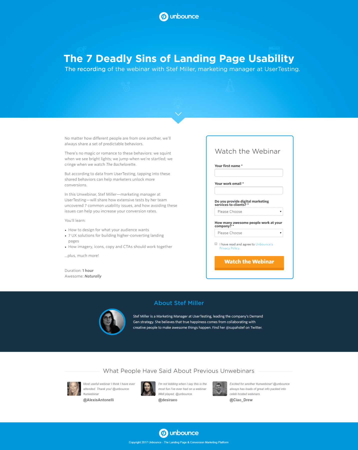
A large compelling title
Intro copy a little on the long side
Solid bullets, but not mind-blowing
The page makes it obvious who the speaker is
Love the social proof.
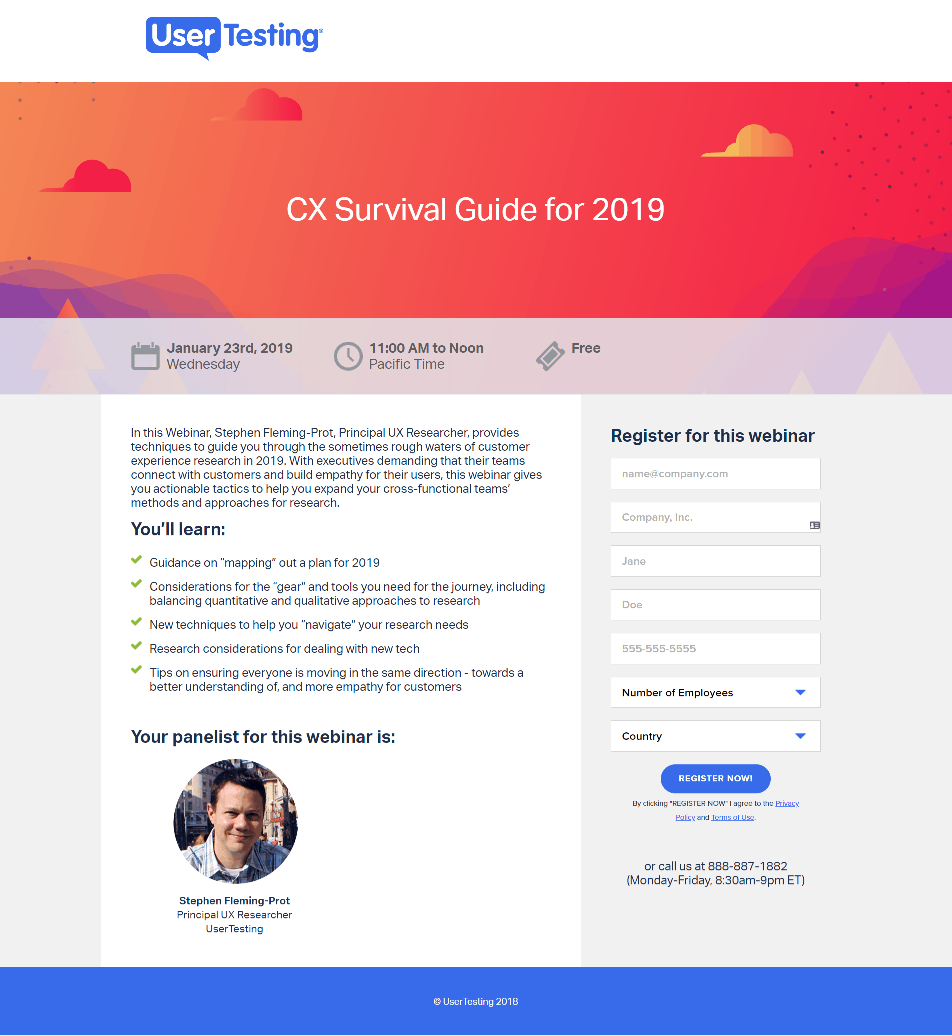
Form asks for more than the minimum but the two extra questions are easy to answer. I’d have done without the company size field.
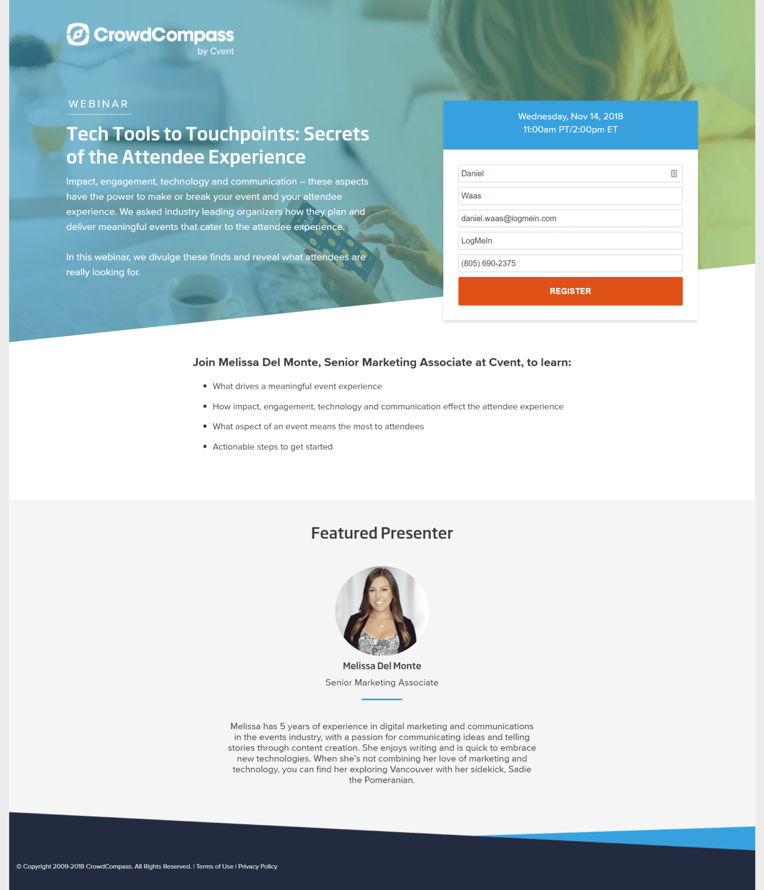
I’d remove the web navigation & focus on driving to just one CTA
Really like the visual consistency & hero image
Like the quick overview of the key information
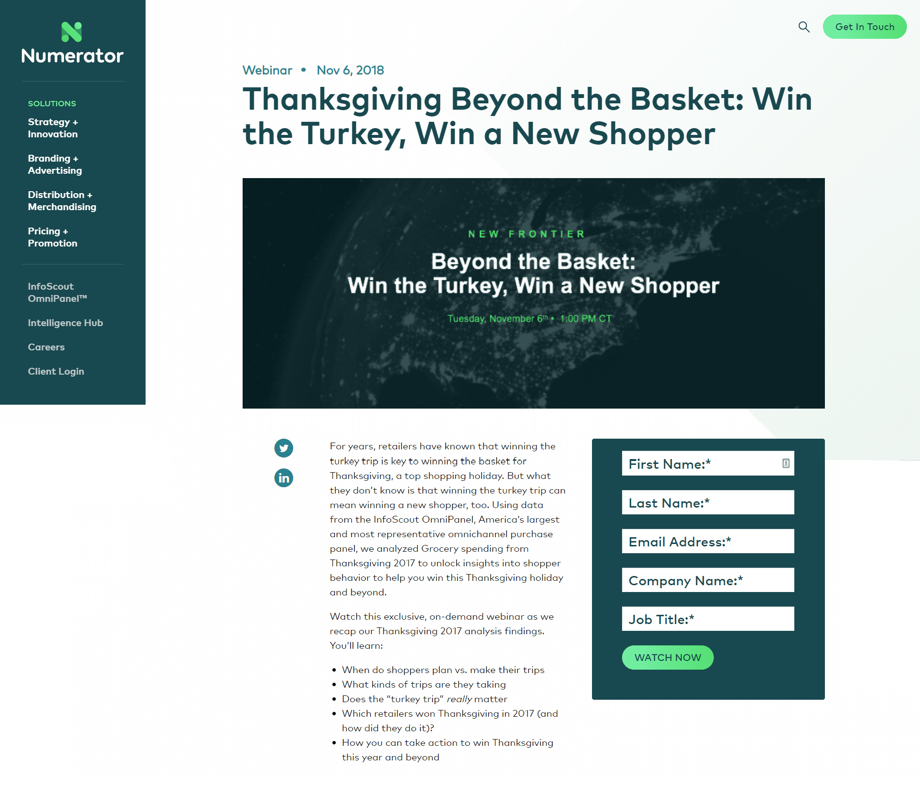
Intro copy a little on the long side
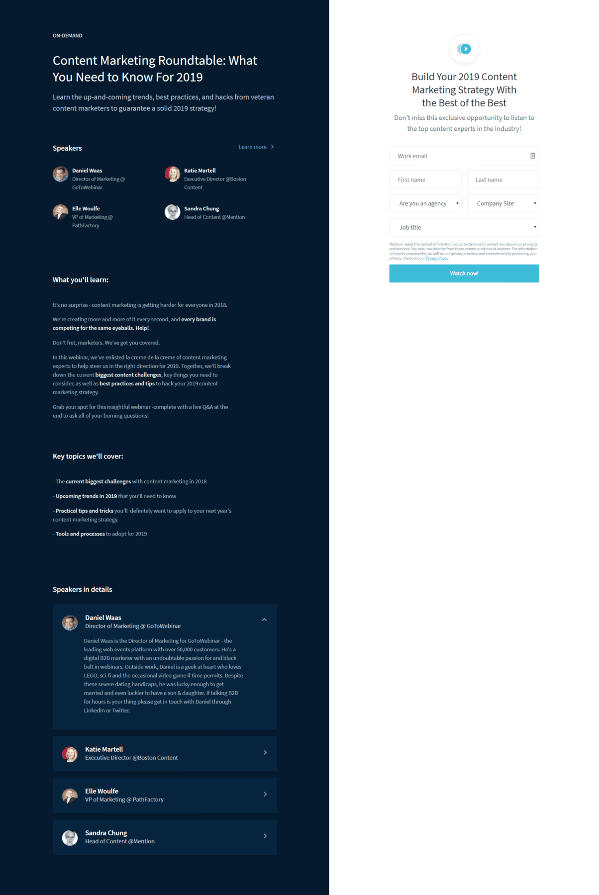
2019 title connects to B2B buyers desire for “News” and recency
Speakers at the top is an easy way to reinforce that this is a roundtable webinar.
A bold headline that makes it easy to understand what the webinar is about.
Clear information on date & time of the event. Bonus points for clarifying it’s free.
Personally would have kept this to three lines max.
Easy-to-read list of key take-aways
Friendly-looking photo of the presenter. Would have loved to learn a bit more about Stephen.
Moderately short form. Could be clearer which fields are required.
Phone number is tricky and might work better with text reminders offered as a value exchange.
Country could be populated from GEO-IP. Number of employees might better be asked through an in-session poll.
Obvious call-to-action and unobtrusive, but highly visible link to terms and privacy policy.
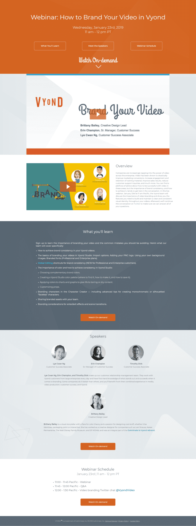
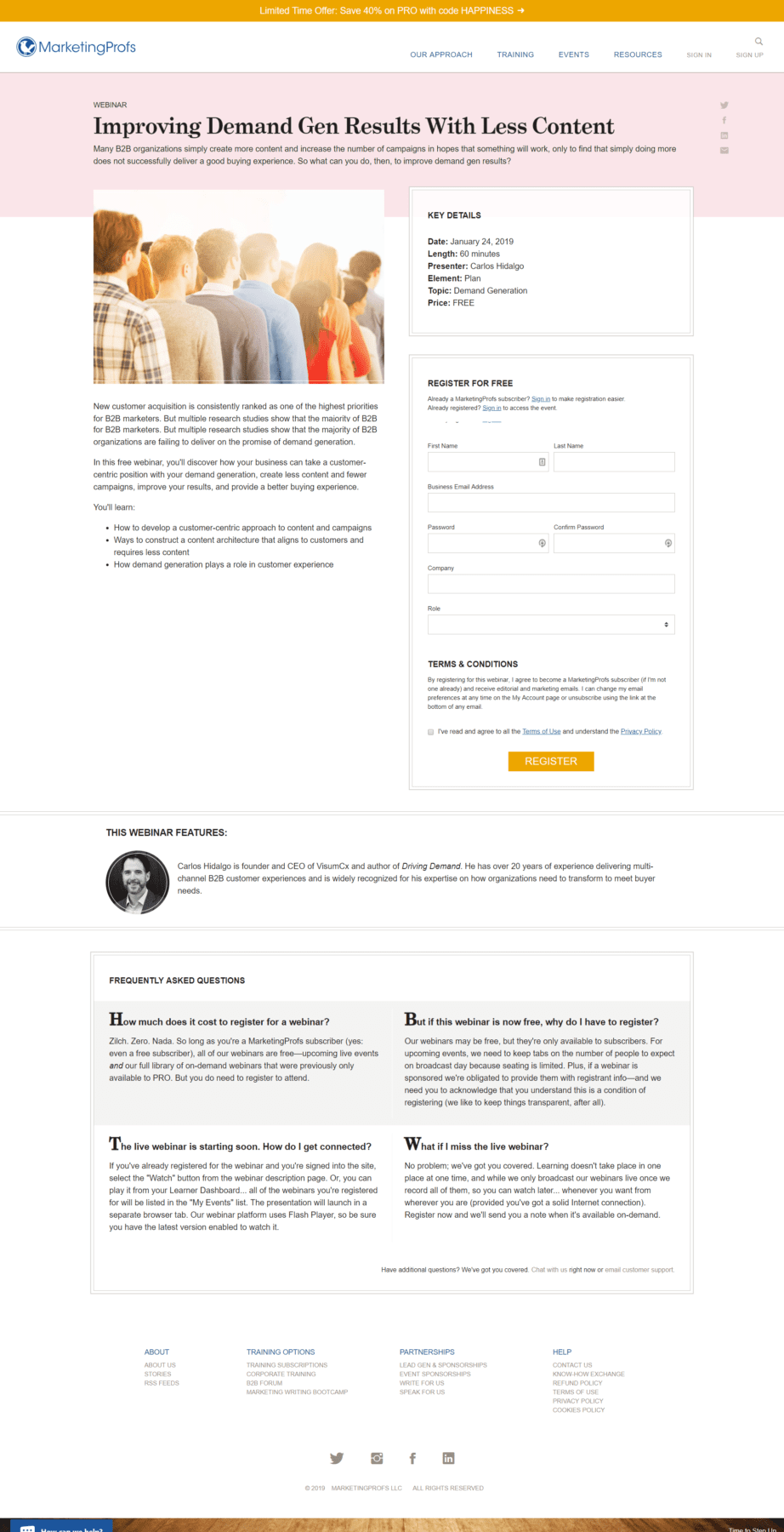
Ignore for a moment that this is the on-demand replay page and imagine instead that only the teaser video below was visible.
Short little teaser video gives viewers a chance to learn more
Great how the call-to-action is repeated multiple times
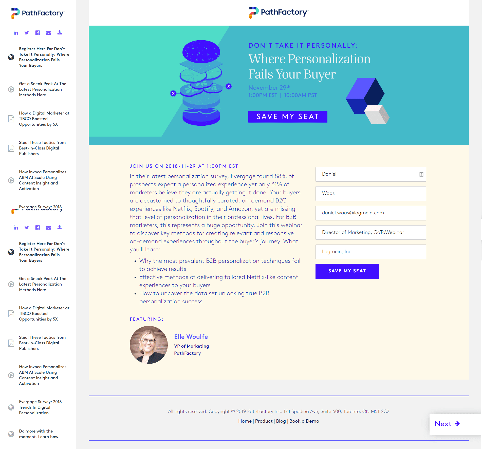
Smart related content gives users a way to binge on content.
Love the illustration style
A short form that auto-populates.