The Quick Guide to Webinar Analytics & Reports (Template Included)

How do you know your webinars are as impactful as you need them to be? What’s your webinar ROI? And how much business did you close because of your webinars?

If you’re running a webinar program and don’t have a firm answer, this guide is for you.

I often talk and write about webinar best practices – and they’re definitely a great place to start – but true success comes from practice, being willing to try new things, and slowly improving over time.

How do you know you’re improving? Because you have metrics as a yardstick.

Metrics you can analyze and draw conclusions from to spark new ideas on what to test.

With webinars, there are five areas of analysis that merit a closer look and regular reporting:

  1. Audience size & attendance
  2. Engagement during the webinar itself
  3. Personal context: where is your audience’s head at on an individual basis?
  4. Performance ratings
  5. Bottom line impact / ROI

Keeping track of your audience

Let’s tackle audience size first.

In a survey of webinar organizers I did a few years back, 65% said email was the most effective webinar promotion tactic. A 25 percentage point difference to the second place (co-marketing).  

That makes the size of your email list one of the most important success factors for your webinars and a leading indicator you’ll want to keep an eye on.

Related metrics are your email open and click-through rates. Next up are your landing page visits and landing page conversion rate. 

These metrics together determine the number of registrations your webinar receives.

Last on the list is the metric I see almost every webinar host obsess about: attendance rate. The average attendance rate for marketing webinars is ~35% and while generally hard to impact, there are some things you can do to increase webinar attendance rate.

Let’s put that all together in a typical webinar funnel:

Metrics of the typical webinar funnel

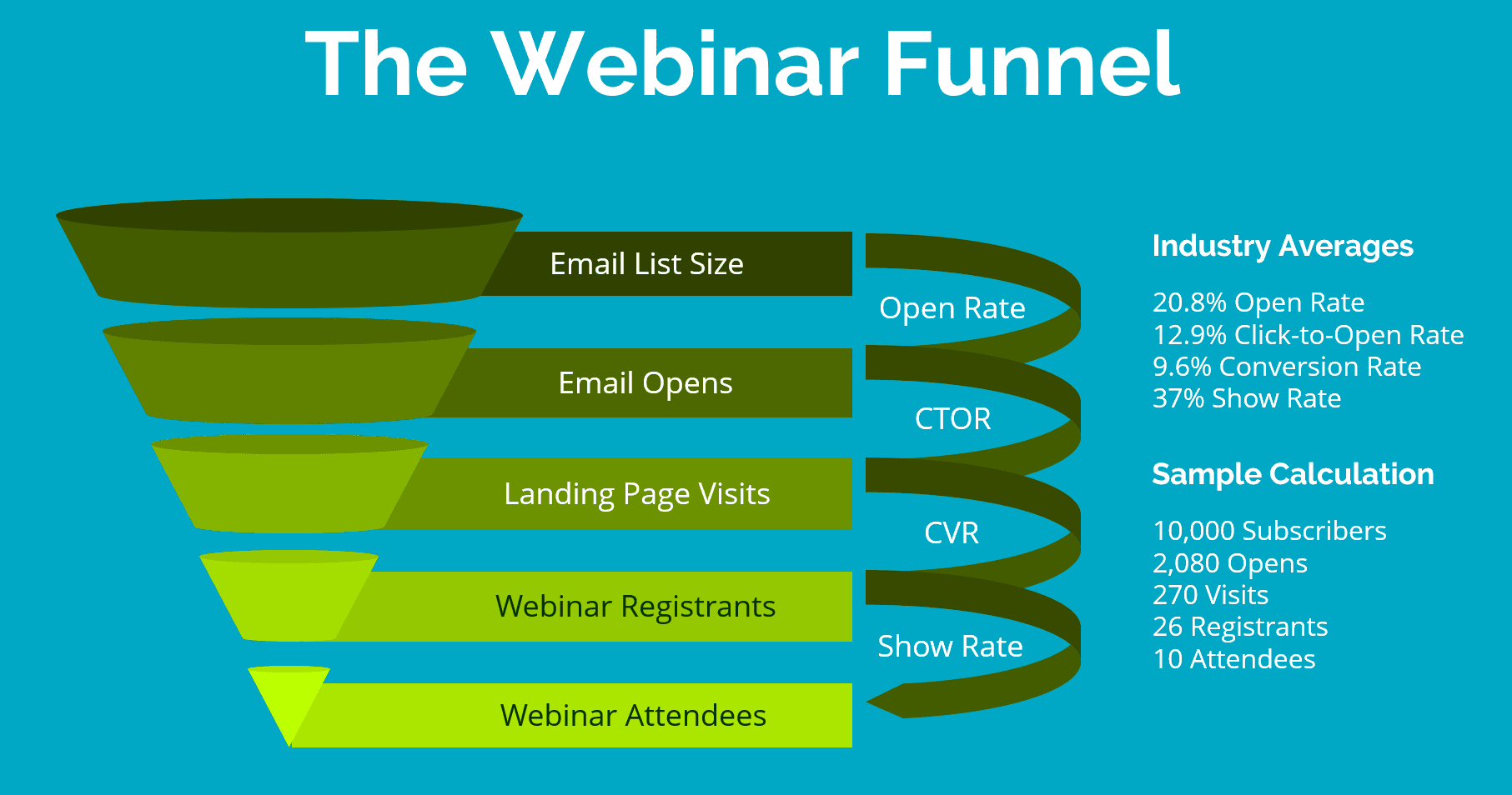
I’ve pulled the industry averages from various benchmark reports. The open rate is from MailChimp, the click-to-open rate from CampaignMonitor, and the LP conversion rate & attendance rate from GoToWebinar.

Actual mileage may vary but this is a good benchmark for your own efforts. 

Looking at the webinars I ran in my last B2B role, here’s a real-life example of how I stacked up:

  • Open rate of 16.8%
  • CTOR of 19%
  • LP conversion of 28.5%
  • Show rate of 32%

That means on average we got 91 registrants and 29 attendees per 10,000 email subscribers. 

How do your own rates compare? Would love to see your examples in the comments at the bottom!

Even though email is the main driver of registrations you should also track the contribution from other tactics like social media and paid campaigns. Most webinar tools offer a way to report on the sources of your registrants based on URL parameters so you can focus on what works.

Measuring webinar engagement

While a full house is great for your ego it’s only the half-way mark to webinar success. Now it’s on you to deliver an insightful webinar that is worth your listeners time investment.

Most webinar tools include an indicator of engagement that scores interest based on the activity of the attendees, but I prefer going by direct feedback:

  1. Volume of questions asked
    Your audience asking a lot of questions is always a good sign. Comparing the absolute volume of questions from webinar to webinar has a couple of challenges but I still track this metric:
    Total questions asked divided by number of attendees = questions per attendee
  2. Responses to verbal prompts
    A tactic I frequently use to prompt audience interaction is to ask a yes/no question and have the audience answer it through the chat. A strong response is another sign your audience is engaged.
  3. Participation in polls
    I have a number of standard polls I include in my webinars. High participation rates not only give me solid segmentation data and stats for social sharing but also allow me to get another read on audience engagement.

Personal context & qualitative analysis

The volume of Q&A and poll responses lets you compare your performance from webinar to webinar. Reading the actual questions and charting the poll results, on the other hand, is where you find the true insights and cues for your follow-up.

There are two ways I recommend for how you can use the Q&A:

  1. Run a report on any questions left unanswered during the webinar & follow up individually with answers. Depending on attendee volume this might not be feasible but it’s a great way to start a conversation.
  2. Make the Q&A data available to your sales team by integrating your webinar tool with your CRM system (or by manually exporting & importing it as a CSV file). 

Your webinar tool will usually give you a standard visualization of poll results. I prefer pulling the actual data as a spreadsheet report and then using a pivot table to analyze the results in more detail. 

Hubspot has a quick guide to get you started using pivot tables in Excel

Below is an example of a chart I created from a poll result.

Webinar Reporting turned into a Chart

Analyzing the performance of your webinar presenter

Registration volume tells you how good you are at selecting attractive webinar topics and promoting your event.

To get feedback on your performance as a presenter simply ask a survey question at the end of the webinar. 

I use a standardized rating scale to report how well my delivery matched attendees’ expectations. Then I trend the aggregated rating over time to see if I’m improving.

Here’s the survey question I ask:

“How would you rate this webinar?”
[Poor | Fair | Good | Excellent]

I calculate the percentage of the total for each answer and then analyze the combined percent of good & excellent.

I aim for the mid-nineties and, if I miss the mark, scrutinize the commentary from anybody who answered “poor” or “fair”.

A good survey question to gather actionable commentary is “Why did you choose this rating?”. 

Comments like “the presenter was going too fast” or “I really liked the example you showed” help you understand what you can improve.

Webinar Reporting: Attendee Rating trended

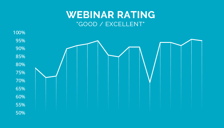
The chart above shows the ratings for seventeen webinars I spoke on – all part of a co-marketing series. I started the axis at 50% for better readability. 

You can see approval rating for the first three events was somewhere in the 70s, but through acting on viewer feedback it is now consistently above 90%. 

The one glaring exception at 69% had great content and a big-time influencer as the main speaker.

Why did it tank? The influencer wasn’t up for a dry-run, joined the session 5 minutes before it was supposed to go live, and then gave a 20-minute sales pitch before tackling the content. I should have insisted on my rule to always have a dry-run. I didn’t. It was an embarrassment 😠. 

Measuring webinar ROI

Whether the purpose of your webinar program is to sell a product or to train a sales team, you must measure the impact the webinars have on your desired outcome.

In a training setting that usually means a graded test or a post-session survey. Both are a staple of webinar tools and easy to implement.

If the purpose of your webinars is to generate leads and new business, your webinar analytics becomes a little more complex. You’ll need to add sales-related metrics to your webinar reports. The typical metrics include:

  • Leads (MQL, SAL, SQL) 
  • Pipeline (Opportunities & their dollar value)
  • Sales

As with any marketing tactic, the relationship between the webinar and the sale is not always clear-cut. You’ll need to integrate your webinar tool with your marketing automation and CRM system to get a read on how your webinars are performing.

Once you have the contact data of the webinar registrants in your CRM you can track their status and see leads turn into opportunities and sales.

For the most accurate picture, you’ll have to get even more sophisticated and put an attribution model in place. 

Webinar reporting dimensions to consider

To improve your webinars over time you’ll need to experiment over time.

Here are the dimensions I commonly test:

  • Webinar type (in-house, influencer/paid speaker, co-marketing, etc.)
  • Start time
  • Weekday
  • Session length
  • Session title

While best practice tips help you pick start times and weekdays that work well in general, only experimentation will tell what works for you. 

As the number of your webinars increases, you can turn the report into a pivot table. With the data laid out in a visual format, it’s easier to spot trends and understand what your audience considers the perfect webinar.

Snag a Free Webinar Reporting Template

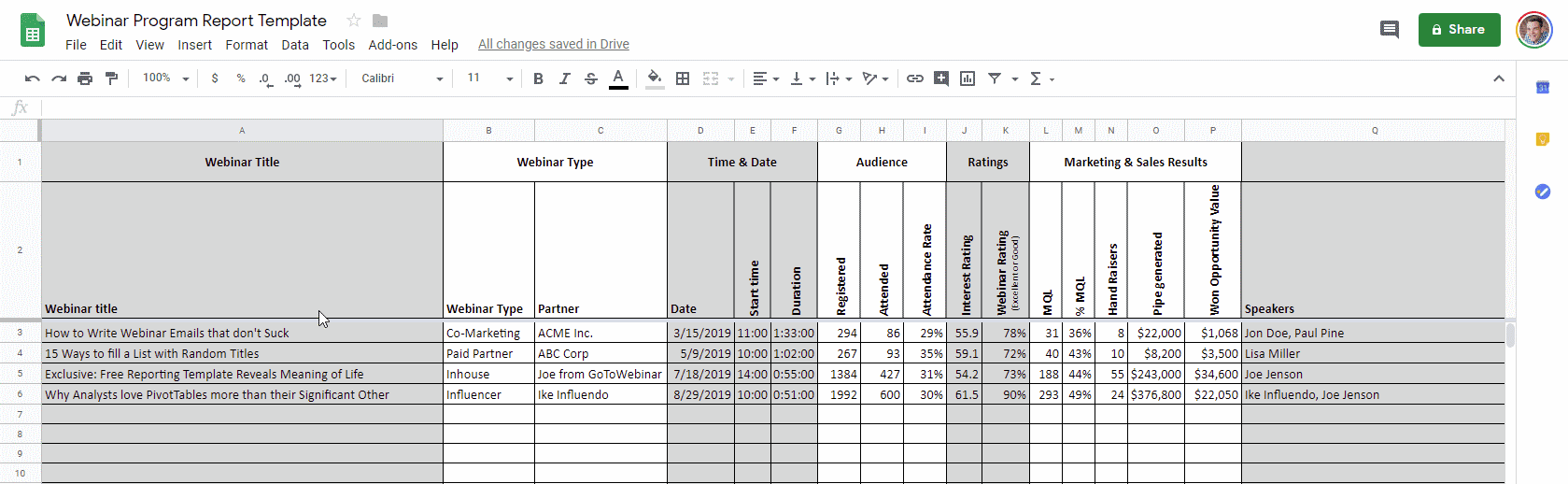
I’m using a simple spreadsheet to keep track of my webinar metrics. It’s nothing special, but it works for me. Feel free to copy and modify it to your needs.

A template to report on webinar program performance

Webinar Analytics & You

I’m curious: what metrics are you tracking that I’ve missed? Do you have any smart templates to share?

And if you have any webinar-related analytics questions, of course, post them in the comments below!

About the Author
Daniel Waas
Daniel Waas

Over the past few years, I've put on over 500 webinars and had a chance to analyze more than half a million sessions run on the big webinar platforms.

Now I run my own online event consultancy and am on a mad mission to end all dull webinars by sharing the best of what we've learned so you can skip the learning curve and turn your webinars into an instant hit.

Outside work, I’m a geek at heart who loves LEGO, sci-fi and the occasional video game. If talking B2B for hours is your thing please get in touch with me on LinkedIn or Twitter.

LIKED THE POST?

Share the love!

Share on facebook
Share on twitter
Share on linkedin
Share on facebook
Share on twitter
Share on linkedin
Share on email